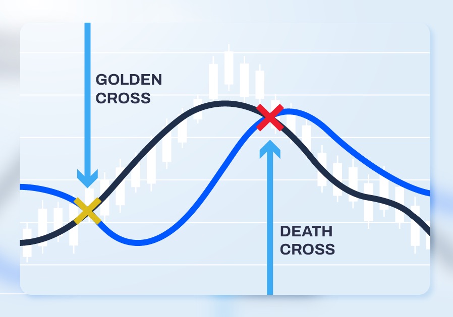
Crypto Golden Cross and Death Cross explained
Reading chart patterns, candlestick patterns, and several other indicators are crucial to start your trading journey. However, keep in mind that the outcome is never guaranteed.
The Golden Cross and Death Cross are two important indicators that traders can spot on a trading chart. Whether you’re a long-term investor or a day trader, understanding these chart patterns can put you one step ahead in your game.
Before we dig deeper into the Golden Cross and Death Cross, let us present a brief overview.
In a bearish market, spotting a Golden Cross means there is a possibility of a market uptrend.
Contrary, the Death Cross is the signal of the end of a bull run. Depending on the situation, you can either jump off the sinking ship and save yourself or, even better, short the market for greater profit.
But remember, these are just predictions based on the assumption that is based on another assumption.
History has shown multiple occurrences of false signals of the Golden Cross and the Death Cross.
What is a Golden Cross?
A Golden Cross is an event on a trading chart where a short-term Moving Average or MA (say, the 50-day) crosses a long-term moving average (say, the 200-day) to begin an uptrend in the market. Moving Average is an average of closing prices in a time frame. It is a trend indicator, which can help identify a trading opportunity.
To understand it better, look at the picture above. The 50-day moving average was way lower than the 200-day moving average. It means the market’s average performance in the past 50 days had been significantly worse than the past 200 days.
But the moment you see the 50-day MA crossing the 200-day MA, it means the market is recovering, and it’s time for a bull run.
That very point of interjection (or crossing) is a Golden Cross.
The likely scenarios of a Golden cross:
- The market is stagnating at a constant rate with no signs of recovery, and you’ve been losing money.
- You keep an eye out for a likely golden cross situation.
- You spot the golden cross and invest in the market before the market realizes it.
- The market starts its recovery, and suddenly everyone is investing once again.
- Now the market is pumped and ready for a bull run.
A Golden Cross scenario is much more profitable when the moving average is in days and not minutes. The day trading market is highly volatile and extremely hard for even pro-level traders. So the wisest thing to do would be to track a 50-day and a 200-day MA instead of the likes of 15-minutes MA and 50-minutes MA.
What is a Death Cross?
Death Cross is the arch-nemesis of a Golden Cross. It’s an event where the short-term moving average (say, the 50-day) finishes its triumph over the long-term moving average (say, the 200-day) and starts a downtrend.
As you can see in the picture above, the 50-day MA comes down hard and collides with the 200-day MA. It means that the market was in a better position in the past 50 days than the average of the past 200 days.
Once it collides with the 200-day moving average and stoops even lower, the downtrend is imminent. Such Death Cross was experienced before the disastrous market crashes like the Great Depression of 1929 and the Great Recession of 2008.
Death crosses are healthy reminders of a drop in the market, but it’s important to note that there are no guarantees. There is no harm in assuming a risk-averse strategy and leave the market early, but it’s not the wisest decision to believe 100% in the outcome.
Conclusion
Short-term trading is a game of risk, even if the returns are exponentially high. Especially in a volatile market like crypto, one bad move can result in a very bad day.
The decisions must be backed up by multiple data points and indicators and not only the Golden Cross sign. The Relative Strength Index (Relative Strength Index), Moving Average Convergence Divergence (MACD), and StochRSI are examples of few such indicators.
